Colour in Context: The Site-Specific World of Tomislav Topic
With Emma-Kate Wilson
Berlin-based Tomislav Topic draws on his materiality for a colourful effect that takes audiences by surprise; they are left questioning what they can see. Colours, form, and textures. Is it paper or something entirely different?
Mitoshi installation by Tomislav Topic at Fairmont Tokyo’s Vue Mer lobby lounge. Photo by Peter Bennetts.
In Fairmont Tokyo, perched high in the sky on level 35, Mitoshi takes inspiration from lightweight Japanese washi paper. But the material is not what you would expect. Instead, it’s fibreglass, a common building material for wall coverings, with an airy quality that moves in the breeze and allows light to pass through its mesh surface.
Fibreglass is a readily available material, easily accessible for an artist with site-specific installations around the world. Importantly, it translates through texture, offering a hologram aesthetic that blurs and merges hues and tones. Something called the moiré effect. “[It’s] when you move your eye, and you can't focus on the front and the back,” says the artist. “It starts to flicker and… the eye creates the colours in between.”
He discovered fibreglass on a serendipitous adventure for a contemporary art festival organised by friends on the Greek Island of Paxos in 2018. Driving around the island on his scooter, Tomislav realised he could use the readily available material along with spray paint to create an installation in an abandoned 400-year-old farmhouse. Suspended from the crumbling building, a kaleidoscope of colourful panels softly sways, playing with light and shadow – entirely site-specific. “This work changed my artistic life,” he remembers.
Tomislav Topic’s installation in an abandoned 400-year-old Paxos farmhouse in Greece. Photo supplied by Tomislav Topic.
“Each installation I create is a site-specific work,” says Topic. “I try to be as sensitive as possible with the space I get offered. I also reject spaces where I know this won't work… when it won’t have a great impact on the space or doesn't merge with the space.”
Equally, it all comes back to colour for the artist, from graffiti passing through on trains in his hometown of Hanover to the formal study of Colour Design. The artist describes how graffiti became an intuitive way to express himself, alongside learning about colour and its impact. He says, “It's always putting colour first and then everything around it.”
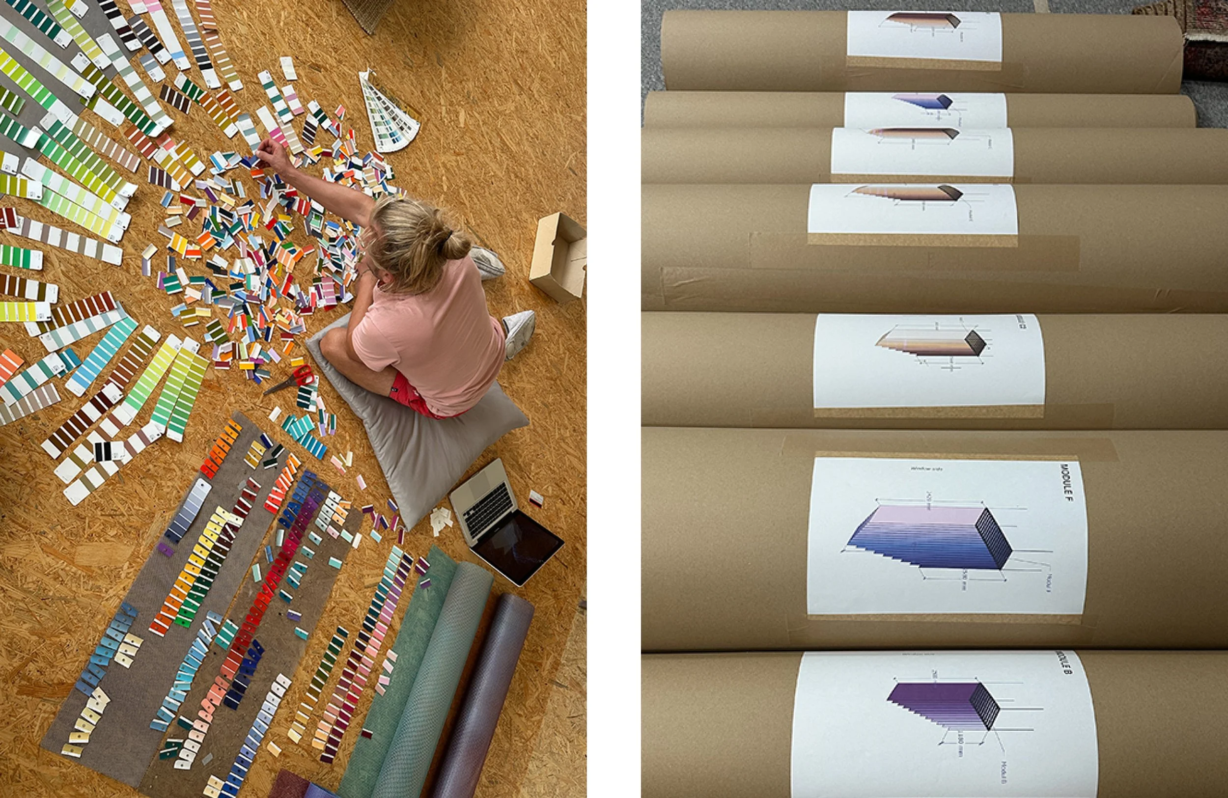
Left: Tomislav Topic puts colour first. Right: Mitoshi set for installation at Fairmont Tokyo. Photo supplied by Tomislav Topic.
For the Fairmont Tokyo installation at the hotel’s Vue Mer lobby lounge, colours blend and fuse with their surroundings. The blues and purples of the Tokyo Bay and sky beyond, and the soft, earthy tones of the hotel bar. Inspired by delicate washi paper and the intimacy of the space, the installation required a new approach. His usual four-millimetre fibreglass would have been too dense. Topic called the manufacturer and asked if they could specially produce a mesh of seven millimetres, needing to order 4000 square metres at a minimum. But here, he reminds the viewer how important detail is: “my biggest approach is to create a work that merges with the space, and, of course, with the people that look at it.”
The artist’s next steps include installations in France, at the “untitled” Art Fair, Miami as a spotlight artist, and then India. He says, “I travel the world because of the installations.” As the works are site-specific and cannot be shown anywhere else, after the artwork is shown, the fibreglass is recycled in the studio. Or even in faraway countries, like China, it may be repurposed in the building industry. With more and more requests for permanent pieces outside, he begins again to rethink the material, looking to the heavy, longer-lasting stainless steel mesh grids for enduring installations.
Topic’s artworks reveal how colour, form, and texture change a space, interpreting light and shadow to create an atmosphere that adapts to its environment. Musing on this in a very digital world, his works reveal how an analogue methodology creates a powerful aesthetic – one that echoes the artist’s hand and its environment, all to an ever-colourful effect.
The artwork’s natural colour palette reflects its environment. Photo by Peter Bennetts.


